Ramroparts: finding motor parts and the people who sell them.
Ramroparts is an e-commerce app that lets people buy motor parts, find vendors and get easy access to contact them. This case study walks through the research, the user flow, the design system, all the wireframes and high-fidelity screens, and the feedback from testing.

The part exists. Finding it is the hard part.
In Nepal, buying a specific motor part usually means visiting several stores. Not every seller is on the internet, general e-commerce sites don't carry the parts people need, and a web search rarely helps find the right vendor.
Ramroparts brings buying and vendor discovery into one app, so a person can search for a part, buy it, or contact the vendor directly.
Three problems the design had to solve
Finding vendors
Sellers of motor parts had to be found through a map, or by searching a specific name, and only if they were listed on the web.
Design response. A Centers area with a list of vendors, a detail page for each, and Call and Chat buttons.Finding parts
The products people needed weren't available on existing e-commerce sites.
Design response. A store built around vehicle parts, with categories and filters by brand, price, part number, common name and OEM reference.Trust and cost
Repeated visits to stores that didn't stock the part, and prices that didn't feel reasonable.
Design response. Clear product pages with ratings and discounts, order tracking, and information about the seller.What I asked, and what it meant.
Method
Client and user interviews, plus user and competitor research. The process ran through five phases: Discover, Define, Ideate, Design and Testing.
Interview questions
- 1
How do you find the vendors for auto parts?
- 2
Do you use online mediums or the internet to locate vendors?
- 3
How successful were you in finding the vendor you were searching for?
- 4
Did you find it frustrating?
- 5
Were the products you ordered delivered to you?
What the research showed
| What I found | What it means for the app |
|---|---|
| Finding vendors and sellers of motor parts was not easy, and meant using a map or searching a specific name. | A vendor directory inside the app, with contact built in. |
| Vendors are only findable if they are listed on the web, and not all sellers are online. | Vendor pages that collect the details a buyer needs in one place. |
| The products people needed weren't on existing e-commerce sites. | A catalogue focused on motor and vehicle parts. |
| Delivery and order status matter to buyers. | Order list, order detail and notifications. |
One rider, one wallet.
Nikhil Shrestha
A software developer who is also pursuing his master's degree. He owns a Royal Enfield bike, and the high charges of service centers for bike parts were putting a strain on his wallet.
Goals
- Search for motor parts and buy them online, without bargaining or visiting the store.
- Get genuine products at a reasonable price.
Frustrations
- Not finding a store that sells the part, even after visiting several.
- Prices that aren't reasonable.
Problem statement
How might we…
let people search for a part and buy it without leaving home?
make vendors easy to find, judge and contact?
keep the buyer informed from order to delivery?
Three ideas, then a flow.
Solutions from the interviews
A proper e-commerce or online store focused on vehicle and motor parts.
Easy access to detailed information about sellers and vendors.
A better UI so users can find the product they are searching for.
Prioritizing what to build first
Must have
- Sign up, sign in and OTP
- Search and product detail
- Cart and checkout
- Vendor list with call and chat
Should have
- Categories and filters
- Orders and notifications
- Saved addresses
Could have
- Flash sale banner
- Wishlist
- Contact form
Later
- Product availability count
- Sign-up by mobile number
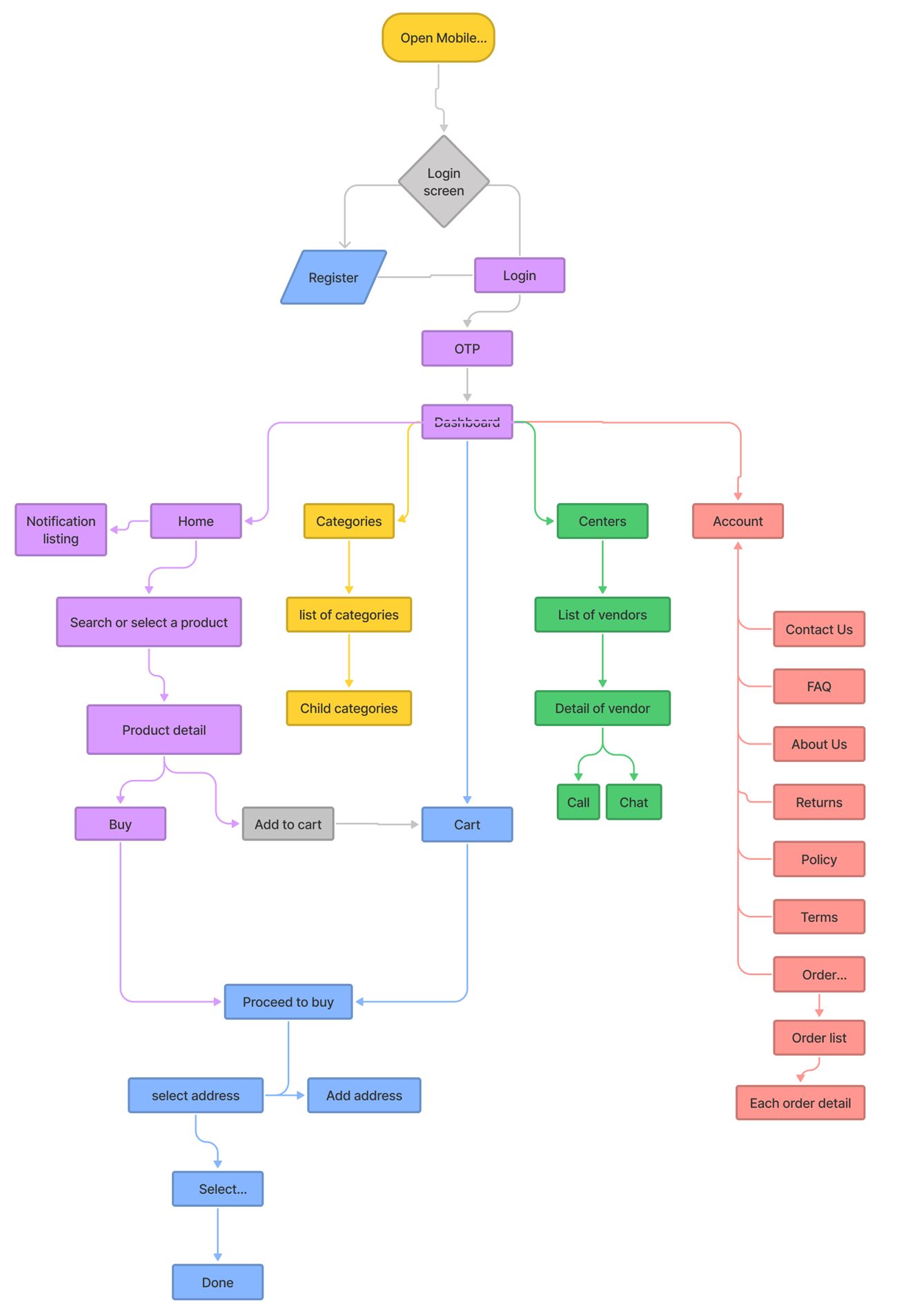
How a person places an order.
After signing in with an OTP, the dashboard branches into five areas, each in its own color in the flow chart. The main path is short: search a product, open it, buy or add it to the cart, choose an address and finish.
Home
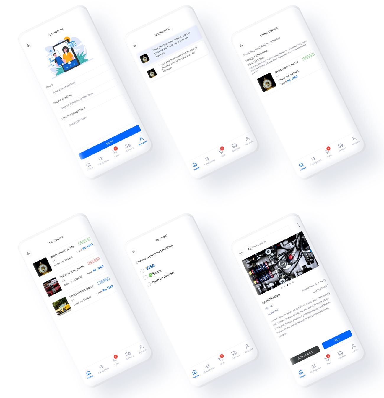
Search or select a product, view its detail, then buy or add to cart. Notifications sit here too.
Categories
A list of categories that opens into child categories.
Centers
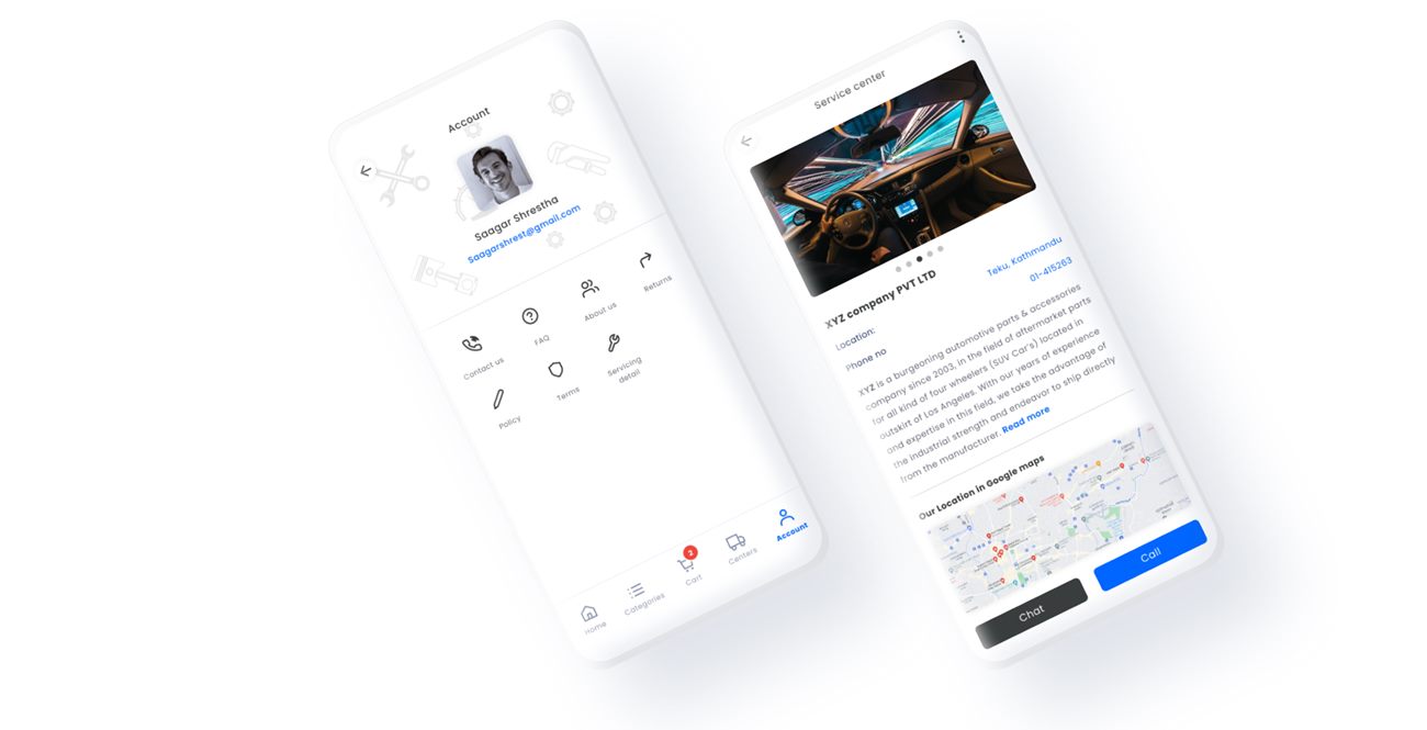
A list of vendors, a detail page for each, and Call or Chat.
Cart
Proceed to buy, select or add an address, choose the next option and finish.
Account
Contact us, FAQ, about us, returns, policy, terms, and the order list with each order's detail.
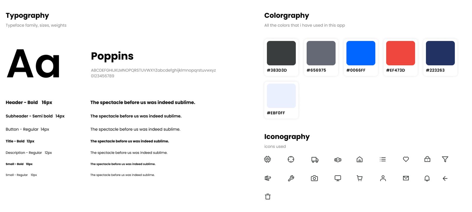
The Ramroparts design system.
One system keeps every screen of the app consistent: tokens for color, type, space and shape, a line icon set, and live components with every state. It grows out of the original style guide, with Poppins, the blue and the line icons kept, and it tightens contrast, size and states so the app is easier to read and to build. Everything below on this page is built from these tokens.
| Use | Sample | Was | Now | Reason |
|---|---|---|---|---|
| Badge and discount text | 2 2 | 3.72 : 1 | 5.58 : 1 | Small white text on #EF473D fails 4.5 : 1. Red 700 passes. |
| Blue text on tinted backgrounds | Blue Blue | 4.24 : 1 | 5.48 : 1 | Just under the minimum. Blue 700 clears it. |
| Primary button label | Buy | 4.83 : 1 | 4.83 : 1 | Already passes for 14 px medium text. Kept, with a darker hover and pressed state. |
| Input borders | Aa | Not defined | 3.24 : 1 | Controls need 3 : 1 against the page to be found. |
| Stock and order status | Ok | None | Green, amber, red plus icon and word | Requested in testing. Color alone would fail WCAG 1.4.1. |
| Smallest text | Aa 11 | 10 px | 11 px minimum, 12 px preferred | 10 px is hard to read on a phone. |
Normal text needs 4.5 : 1. Large text and interface components need 3 : 1.
| Pair | Sample | Ratio | Text | UI |
|---|---|---|---|---|
| Ink on white | Aa | 11.04 : 1 | ✓ Pass | ✓ Pass |
| Grey 700 on white | Aa | 5.48 : 1 | ✓ Pass | ✓ Pass |
| Grey 700 on Grey 50 | Aa | 5.07 : 1 | ✓ Pass | ✓ Pass |
| White on Blue 600 | Aa | 4.83 : 1 | ✓ Pass | ✓ Pass |
| Blue 700 on white | Aa | 6.24 : 1 | ✓ Pass | ✓ Pass |
| Blue 700 on Blue 50 | Aa | 5.48 : 1 | ✓ Pass | ✓ Pass |
| White on Red 700 | Aa | 5.58 : 1 | ✓ Pass | ✓ Pass |
| Green 700 on Green 50 | Aa | 4.73 : 1 | ✓ Pass | ✓ Pass |
| Amber 800 on Amber 50 | Aa | 5.41 : 1 | ✓ Pass | ✓ Pass |
| Input border on white | Aa | 3.24 : 1 | Not text | ✓ Pass |
| Old: white on brand red | Aa | 3.72 : 1 | ✕ Fail | ✓ Pass |
| Old: blue on tint | Aa | 4.24 : 1 | ✕ Fail | ✓ Pass |
24 / 32 · Bold
16 / 24 · Bold
14 / 20 · Semibold
14 / 22 · Regular
14 / 20 · Medium
12 / 16 · Bold
12 / 16 · Regular
11 / 14 · Medium
Every component, live.
These are working components. Tab through them, press them and read the rule behind each one.
Automotive parts and accessories for four wheelers, in business since 2003.
We'll notify you when it ships.
Complete your order soon to secure this part.
Your card was not charged. Try another method.
Your cart is empty
Find a part or browse a category to get started.
Putting components to work.
9812345678
| Law or heuristic | Rule in this system |
|---|---|
| Hick's Law | Five tabs at most. Filters live in a drawer and show only when asked. |
| Fitts's Law | 48 px targets, 8 px gaps, primary actions full width at the bottom. |
| Jakob's Law | Search on top, bottom tabs, cart badge and star ratings, as in other shopping apps. |
| Von Restorff Effect | One filled blue action per screen. Everything else is outline or text. |
| Doherty Threshold | Responses under about 400 ms. Loading shows a skeleton and a busy button. |
| Goal-gradient effect | A step bar in checkout shows progress toward the order. |
| Recognition over recall | Visible labels, labeled icons, and a filter list that shows every option. |
| Error prevention and recovery | Inline validation, confirmation before removing an item, Undo on toasts. |
- Text 4.5 : 1 and UI parts 3 : 1, guaranteed by the tokens above.
- Target size. 48 px minimum, above the 24 px AA requirement.
- Visible focus. 3 px Blue ring with a 2 px offset on every control.
- Labels and names. Visible field labels and accessible names on icon buttons.
- Not by color alone. Stock, order status and errors always add an icon and words.
- Reflow and zoom. Works at 200% text size and 320 px width.
- Reduced motion. Animations are removed when the user asks for less.
- Easy sign-in. Paste works in the OTP field and the code names where it was sent.
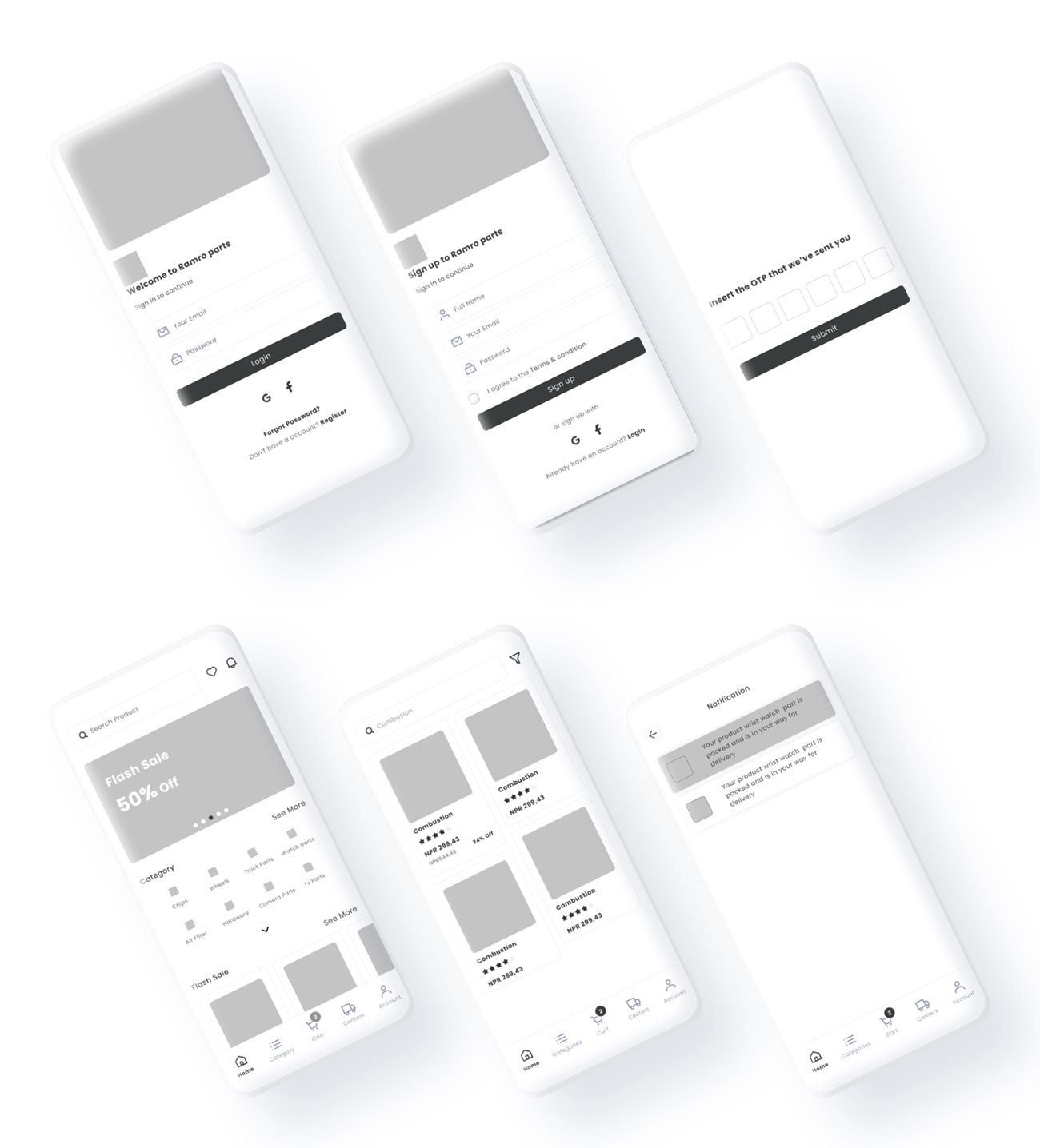
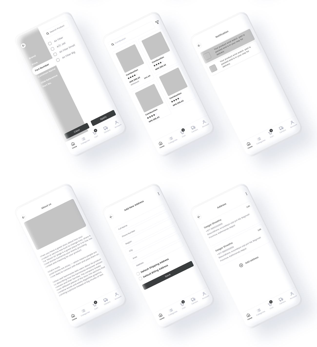
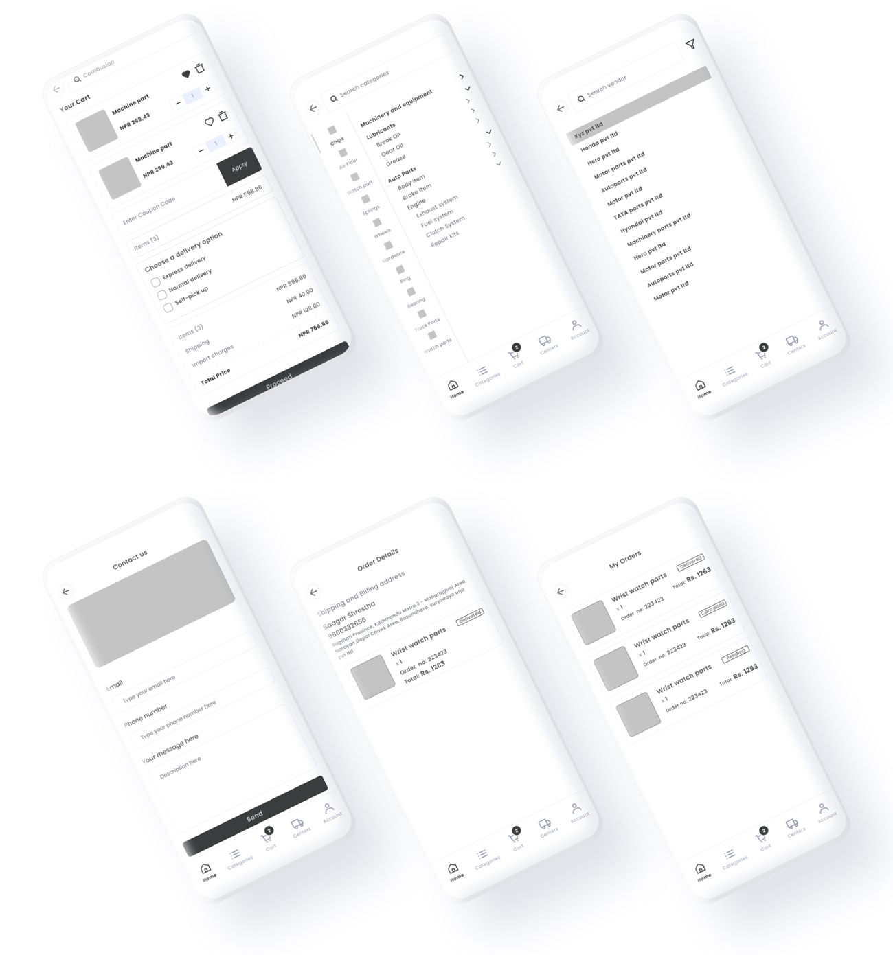
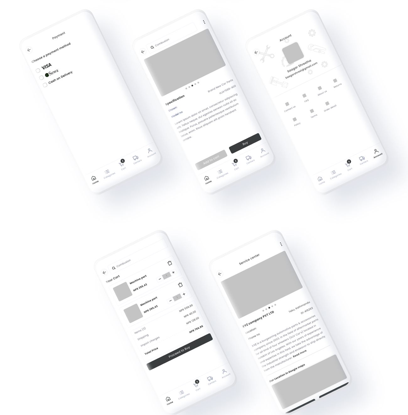
Structure first, in grayscale.
Every screen of the app was wireframed before any color or photography. Grey boxes stand in for images, so the work is only about layout, hierarchy and flow.
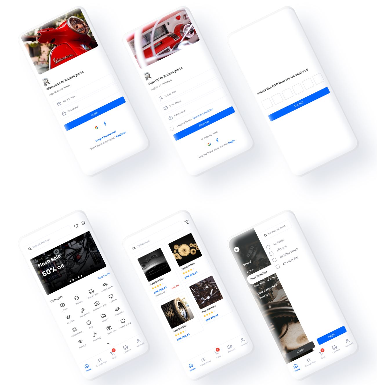
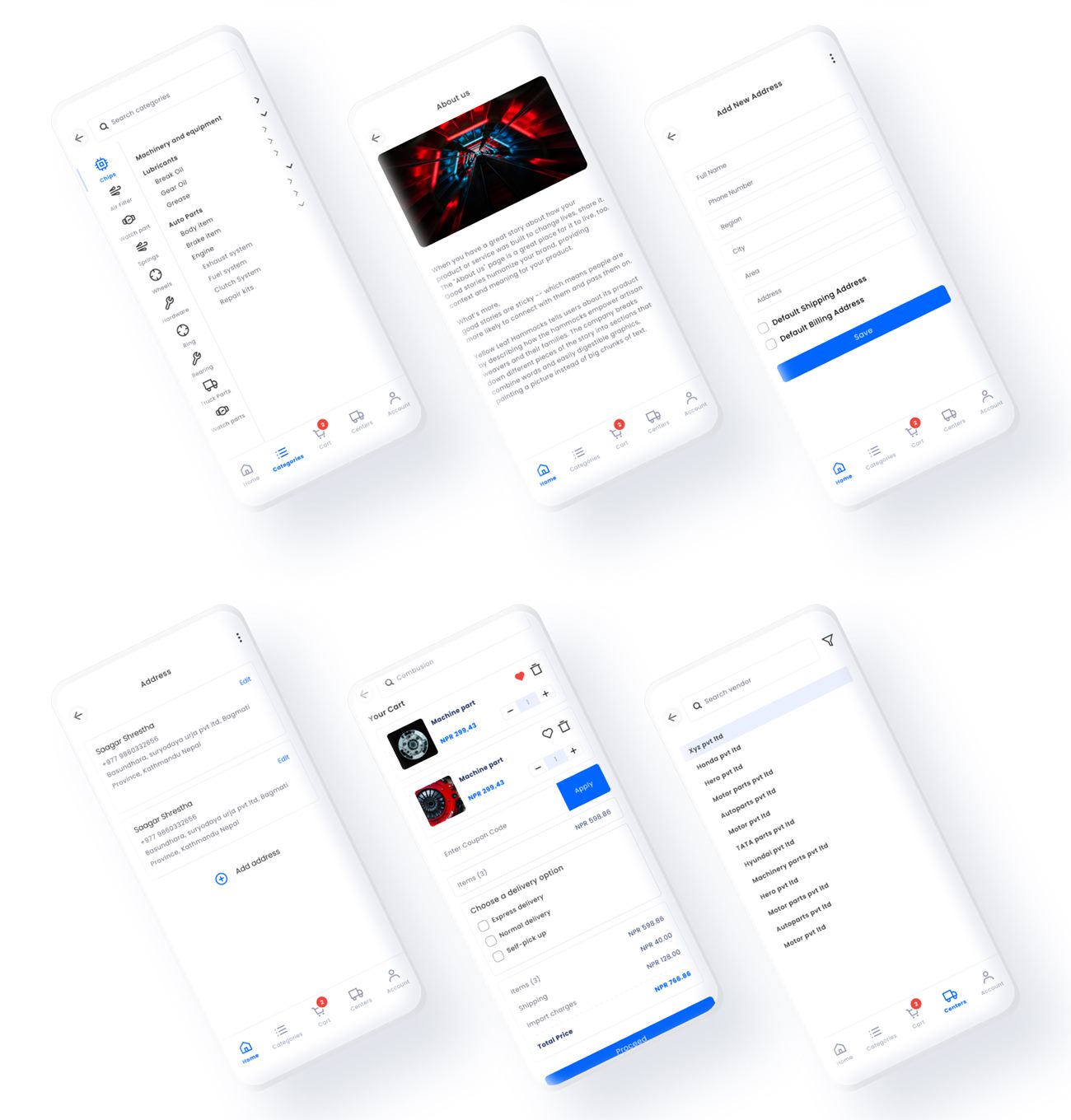
Adding color, photography and life.
The high-fidelity design applies the style guide to the approved wireframes. Photography sets the mood on entry screens and product pages, while one blue is reserved for the actions that matter: login, apply, buy and call.
Decisions, and the reasons.
| Principle | Where it shows up in Ramroparts |
|---|---|
| Hick's Law | The bottom tab bar has five destinations. Filters are hidden in a drawer until needed. |
| Jakob's Law | Search on top, cart badge, bottom tabs and product grids follow patterns people know from other shopping apps. |
| Fitts's Law | Add to cart and Buy, and Call and Chat, are large buttons at the bottom of the screen. |
| Von Restorff Effect | One blue is used for the primary action on each screen, so it stands out from everything else. |
| Recognition over recall | Line icons paired with labels, and a filter list showing exactly which fields can narrow results. |
| Visibility of status | Cart count badge, notification list, and order list with order detail. |
| Trust | Vendor pages with a map, description and contact make sellers feel real. |
What I'd fix in the next round.
I reviewed the finished screens against usability heuristics and WCAG. I measured the palette's contrast to check the numbers below. The design system above already applies the fixes.
| Finding | Principle | Severity | Proposed fix |
|---|---|---|---|
| The style guide's smallest text is 10 px, and much of the secondary text in the screens is very light and small. | Legibility, WCAG 1.4.3 | Major | Raise the minimum to 12 px and keep body text on ink or grey. |
| The red (#EF473D) reaches only 3.72 : 1 on white, so it fails for small text such as the cart badge count and discount tags. | WCAG 1.4.3 Contrast | Major | Use a darker red for text and badges, keeping the bright red for large graphics. |
| Blue on the light blue tint (#EBF0FF) is 4.24 : 1, just under the 4.5 : 1 needed for normal text. | WCAG 1.4.3 Contrast | Moderate | Darken the blue used for text on tinted backgrounds. |
| Many tab bar and card labels are tiny, in light grey, and hard to hit accurately. | Fitts's Law, touch target size | Moderate | Make tap areas at least 44 px and increase label size. |
| Sign-up depends on an email and social login, and the flow asks for an OTP without saying where it was sent. | Visibility of status | Moderate | Name the destination on the OTP screen and add a resend timer. Testers also asked for sign-up by mobile number. |
| Product cards don't show whether a part is in stock. | Visibility of status | Moderate | Add an available count, which was also requested in testing. |
| Some placeholder content, such as repeated sample text and a sample company, is still visible. | Content quality | Minor | Replace it with real vendor and product copy. |
What testing told me.
After completing the UI design, I tested the prototype with other users and colleagues to check how easy the UX flow was. It revealed usability issues that I could solve.
Show the available product count
So buyers know how much of a part is available.
Sign up with a mobile number
Testers said this could be useful for people who prefer a phone number to an email.
Design for the whole journey
Finding a vendor mattered as much as buying the part.
Check contrast early
A vivid brand red looks great and still fails for small text.